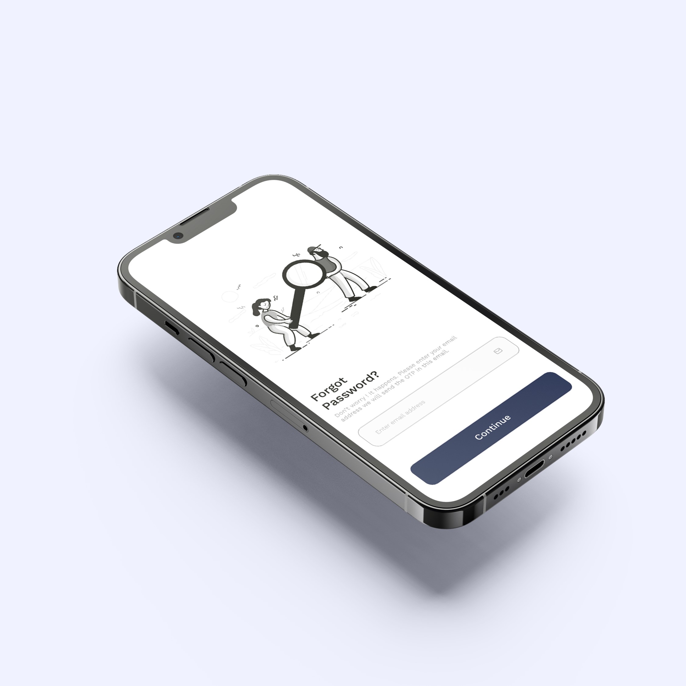
The challenge was to create a UI design that was both visually appealing and easy to use. I wanted to create an interface that was clean and uncluttered, but also wanted to make sure that all of the features of the app were easy to find and use.
I got inspiration from the company's branding while trying to generate colors for the app's interface. I used clean and simple icons for the ui and I wanted the illustrations to come from a single pack and that was really hard to accomplish since we didn't have the budget to buy a premium illustration pack.
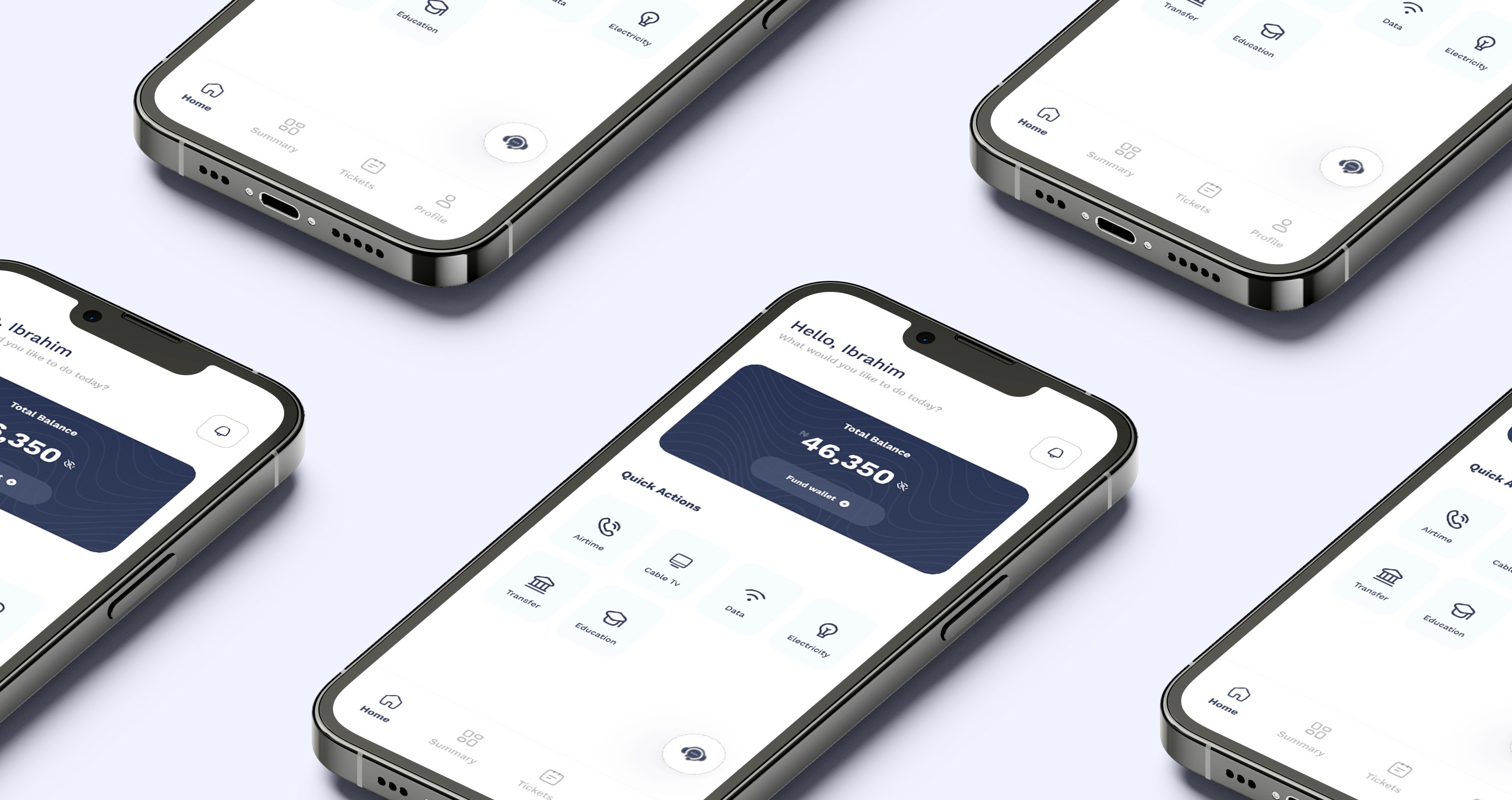
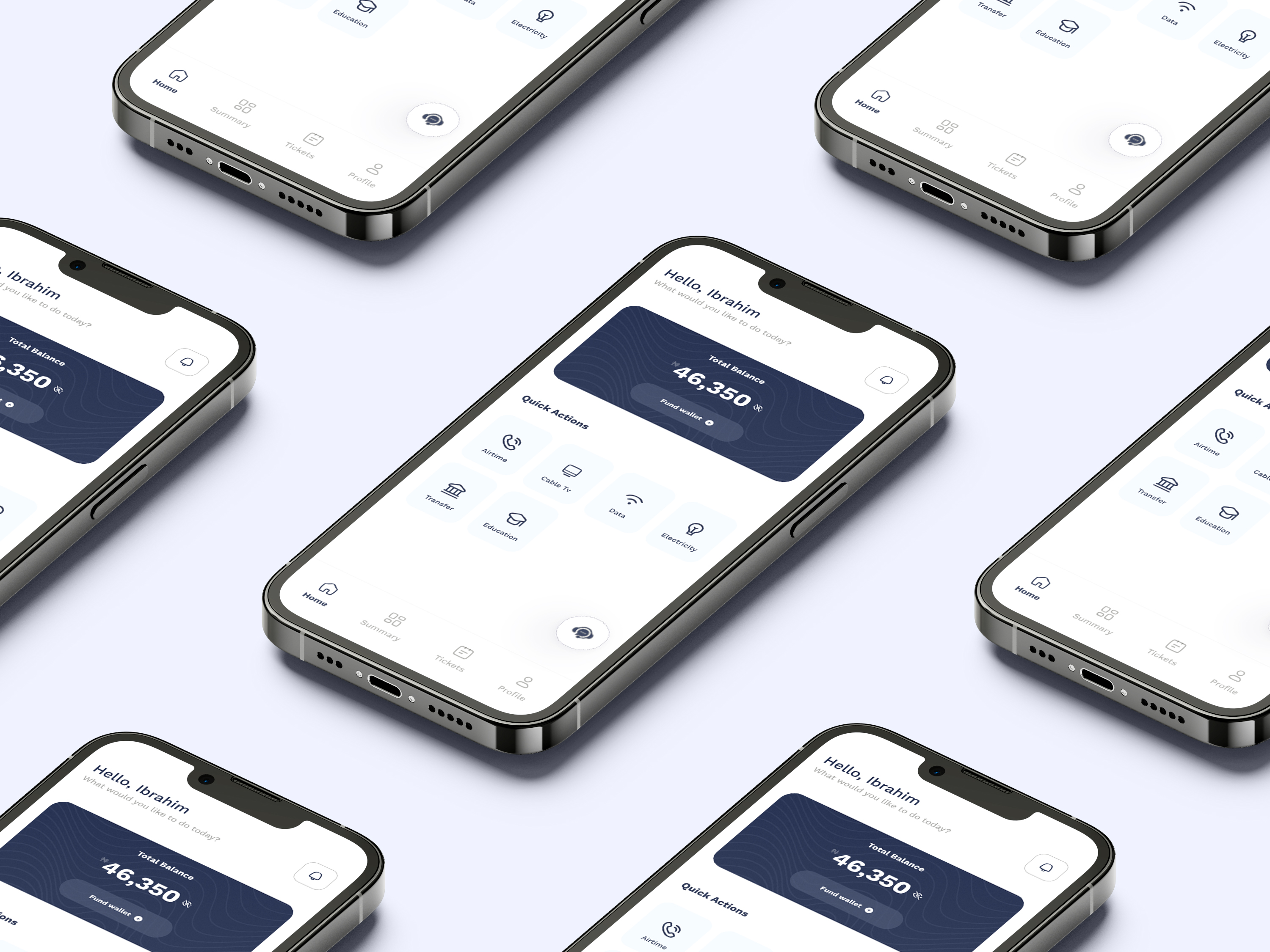
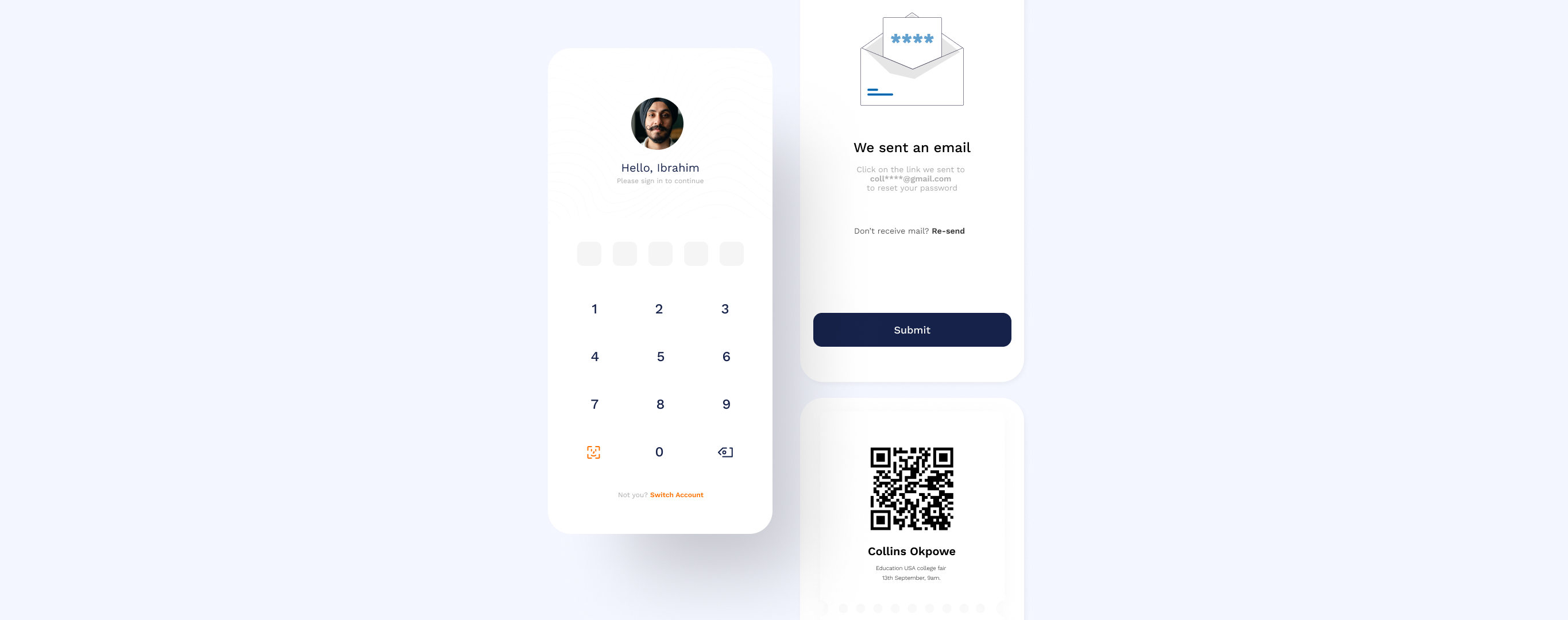
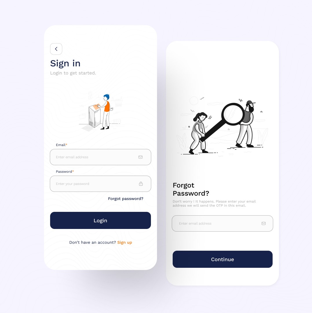
The interface is consistent throughout the app. Users can expect the same basic elements to be in the same place on every screen. This makes it easy for users to learn how to use the app and to navigate between different screens. All of the text and icons are large and easy to read, and the layout of the interface is simple and straightforward.

The interface uses visual cues to indicate the hierarchy of information. This helps users to quickly identify the most important information on the screen. The interface provides feedback to users when they interact with it. This helps users to confirm that their actions have been registered and to understand what is happening next.
The UI design of the Subremit app is a great example of how UI design can be used to create a user-friendly experience. Using a variety of UI design principles to create an interface that is clear, consistent, hierarchical, and provides feedback to users. This resulted in an app that is both visually appealing and easy to use.