
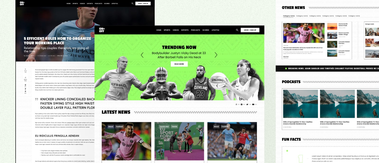
ON+OFF is a was a brand that wanted to write about sports but didnt want it to feel like sports. They wanted people to feel like they were reading People magazine, E news or Variety. so the goal was to try to create a sports website that felt like it was reporting pop culture and thats what i did.

The first step in creating this project was figuring out what makes these entertainment sites so addicting to read and try to incoporate that in a sports site. i reviewed a few of these sites and recogised some similarities. their layout was so simple, they knew what would attract people and they showed that to you first.
After research, the client said they wanted the site to feel like it came out of Africa so we came up with an idea to use some type of pattern on the background. we incoporated these patterns on the main hero image as well as the overall background of the site although it's very subtle and that's the point, it's there but doesn't distract the users from what matters.


Even with all these details, we wanted the site to be minimalistic, not crowding too many elements together. we used a simple layout and used stroke outlines to separate elements from each other and a zig-zag line and a heading to indicate the start of a new section in the site.
ON+OFF is a sports website that aims to report sports news in a pop culture-like manner. The website uses a simple layout with subtle African patterns to create a minimalistic and user-friendly experience. The website also uses stroke outlines and a zig-zag line to separate elements and indicate the start of new sections. Overall, ON+OFF is a successful website that achieves its goal of creating a sports website that feels like it is reporting pop culture.